Easylaser
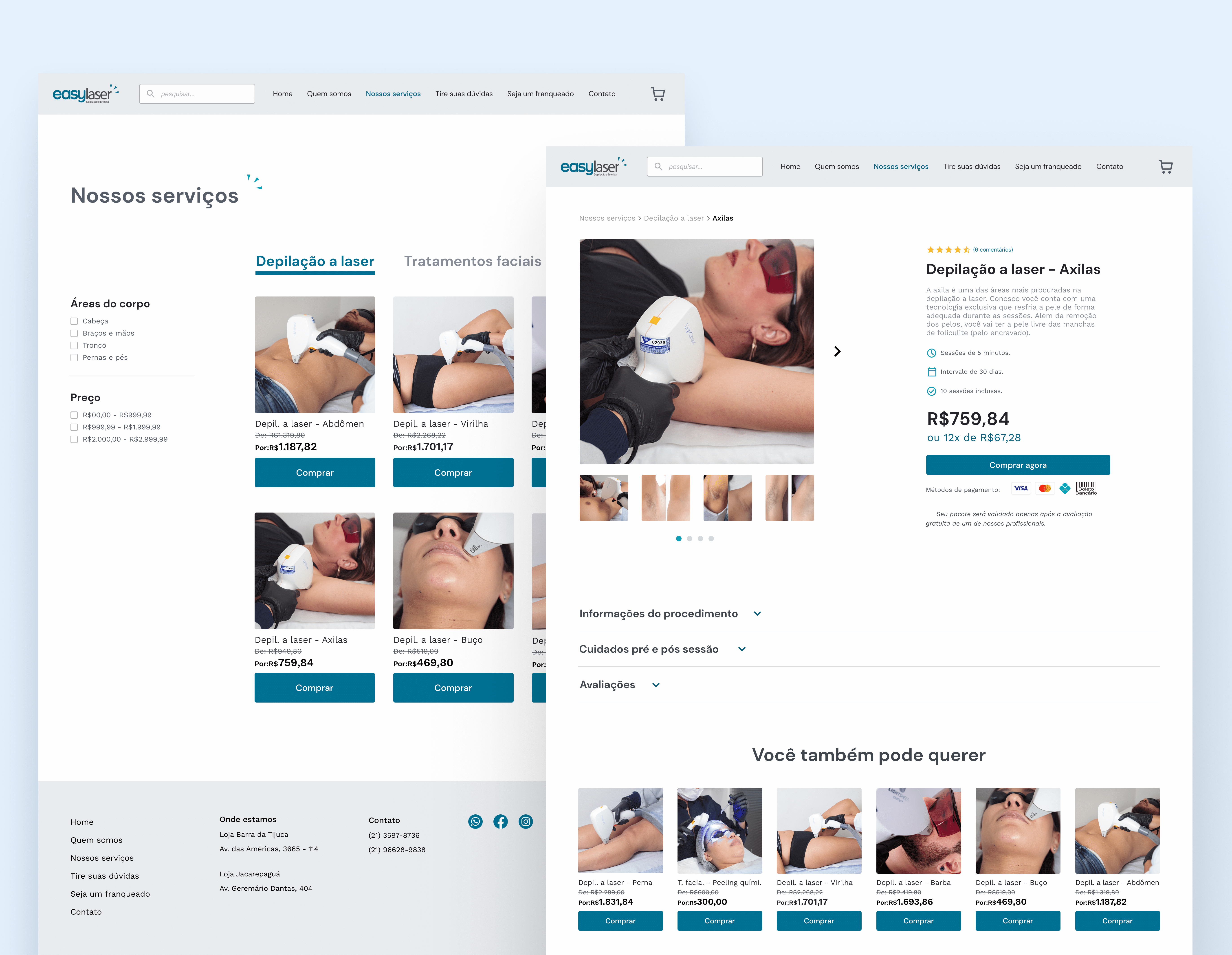
Redesign of a laser treatments website with the aim of improving the user experience in navigation and in the purchase flow.
Overview
As part of the Design Circuit course, we had a real client who wanted their website reviewed for a possible redesign. I did the project individually and participated in the mentorships with weekly feedback from the course teacher, together with other students who also practiced.
Duration
13 weeks (July 2022 – October 2022)
My role
Research, UX and UI Design
Tools
Figma, Notion, Miro, Paper and pen
Context
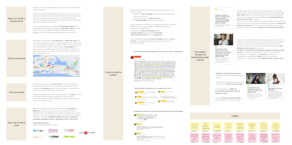
Easylaser is a franchise specialized in laser treatments located in Rio de Janeiro. They offer laser hair removal services on various parts of the body and facial treatments such as skin cleansing and peeling. The online performance of the website was not as expected by the client, and therefore a research process was initiated.
Problems
During the initial stage of gathering information and research, I identified that:
- the website did not have good conversion of online purchases.
- users couldn't find the information they needed
- site flows were confusing, overlapping
- some sections of the site were little or not used/accessed.
- lacked an efficient scheduling system
Solutions found
At the end of the project, I came up with some solutions:
- greater possibility of personalization in the purchase
- restructuring of hierarchy and navigation
- search bar and FAQ section
- checkout within the flow of the company's website.
- possibility of scheduling through the website
Starting to understand the problem
Gathering information
To confirm the problems and hypotheses and discover other points of attention, I resorted to some techniques. Initially, I used desk research to gather as much information as was already available on the internet and better understand the customer's context.
I discovered that it is a growing market, with high demand. Customers usually buy more than one treatment (on different parts of the body) and men are increasingly interested, although there is still a barrier of prejudice.
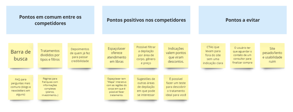
I then selected the main competitors in the market and took notes of the experience points of each one to identify strengths and weaknesses. I also wanted to focus on how the main “players” in the market (espaçolaser and giolaser) solved some of our problems.
"Users can't find what they need on the website"
Usability testing
I realized that I needed to explore some assumptions about the products's usability and understand whether it was effective for selling laser procedures. In addition, I wanted to understand the user's journey within the site.
For this, I wrote a script with 4 scenarios and some follow up questions after the tasks. In order to eliminate possible biases, I recruited 3 people who were interested but had not yet purchased laser procedures. Main findings:
- No users clicked on the Virtual Store (which is exactly where they “should” click to buy a treatment directly). To enter the virtual store, they took the alternative path Treatment > see all
- Two users, when directed to whatsapp by the main home button, thought they were still on the website and tried to click on other menus.
- No user interacted with Light Sheer Desire (technical area about the equipment that the client said was its main attraction).
- No user found the FAQ ebook
- Users wanted to know information that was not on the website.
- One user said not being able to edit and add to cart "difficult"
- The virtual store does not have all the products, and depending on where you click on the card, it directs you to different pages.
Heuristics
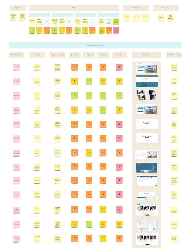
Analyzing the site with Nielsen's heuristics, I confirmed some more usability problems, such as little visibility and feedback of what happens on the site, lack of standards and difficult paths not easily recognizable by users.
What users say
Survey
In order to understand people's experience when having contact with a hair removal/laser treatment service in general, I prepared a survey. It was carried out with 9 users, targeting people who have already had or are interested in having some type of laser treatment.
I found some points in common among the participants:
67% were interested in laser treatments through recommendation and 33% through social networks
A decisive factor for the purchase is the company's credibility, as it is a high investment.
There are still many doubts and fears associated with the laser (if it hurts, if it leaves marks, if the result lasts, how many sessions…)
Untrained professionals and difficulty scheduling were the two main pain points among those who have already had some type of laser treatment.
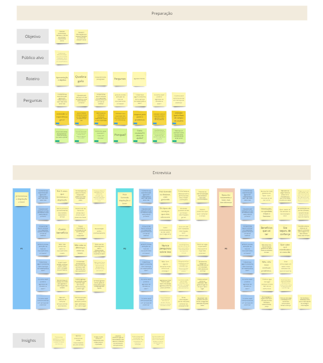
User interviews
At this point, I thought it was necessary to delve into some questions about preferences, habits and online shopping criteria and talk to potential users to resolve doubts that were still unclear.
I chose to interview 3 users in different stages, one who has never had laser treatment, another who is doing it and one who has already completed it. Main insights:
- Customer was satisfied at the beginning of the treatment and over time this decreased
- Many problems are related to after sales
- Laser is seen as an expensive treatment, so price and quality are important.
- Users prefer to call or use whatspp to schedule sessions but do not have models for purchasing online services
- Users are initially guided by the evaluation of other people, be it comments on the internet or recommendations
- One of the users, when he couldn't find what he wanted on the site, gave up buying laser treatment
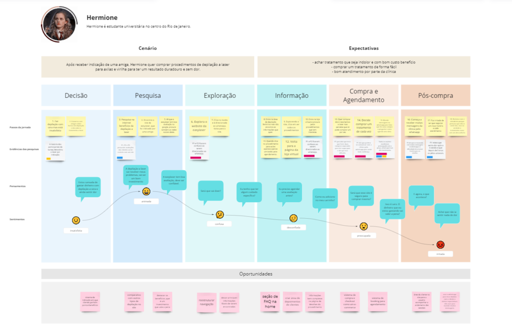
User journey
Building the solution
Categorization
As the navigation proved to be a significant problem since the beginning of the research, mainly in the usability test, I performed an open card sorting with six users using the Optimal Workshop tool. The objective was to identify better ways of browsing according to users' mental models.
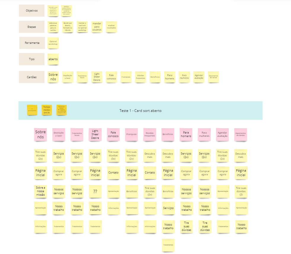
Navigation proposal
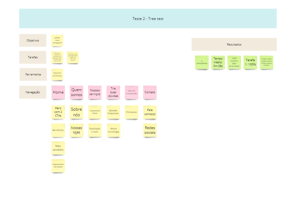
From this grouping of information, I validated the result with a tree test. The final categories proved to be more direct, forming an intuitive menu that provides information to the user's main tasks within the website.
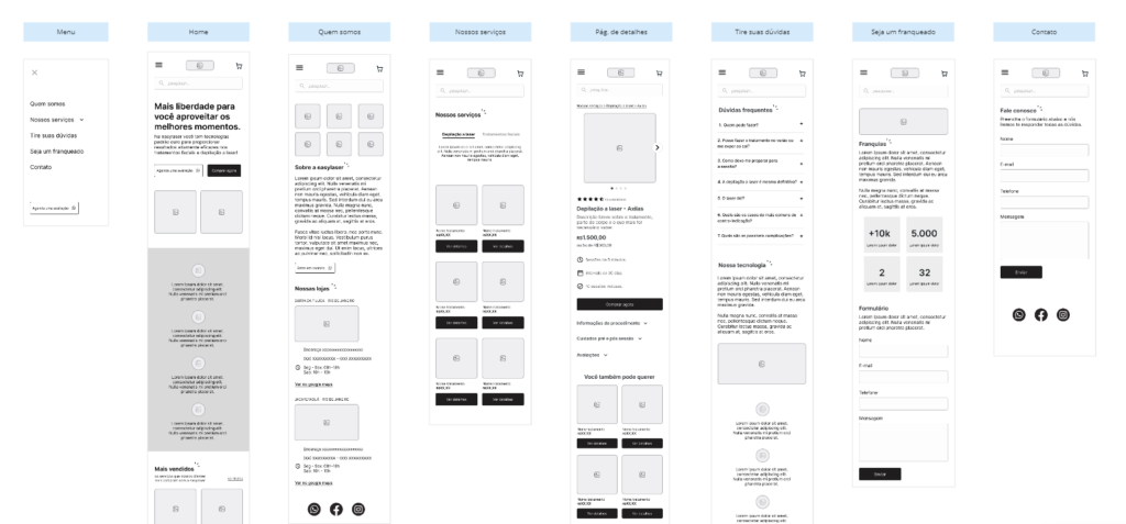
The new menu has the categories of Home, Who we are, Our services, Ask questions, Become a franchisee and Contact.
Designing solutions
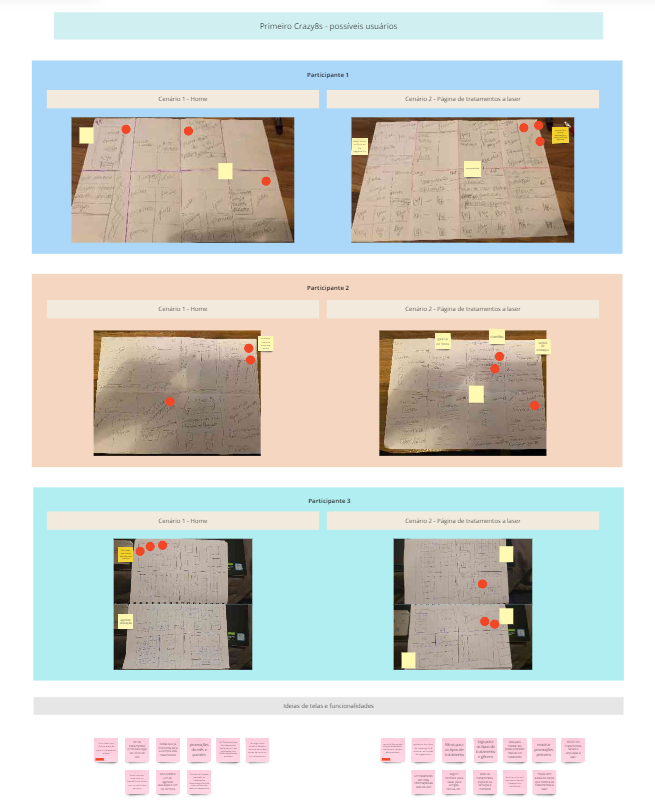
In this phase I held a crazy 8s workshop with 3 people to get more insights and identify the users' perception about areas of the website. We did two rounds, one in which the focus was on designing solutions for the home and another for the details page.
Mobile first
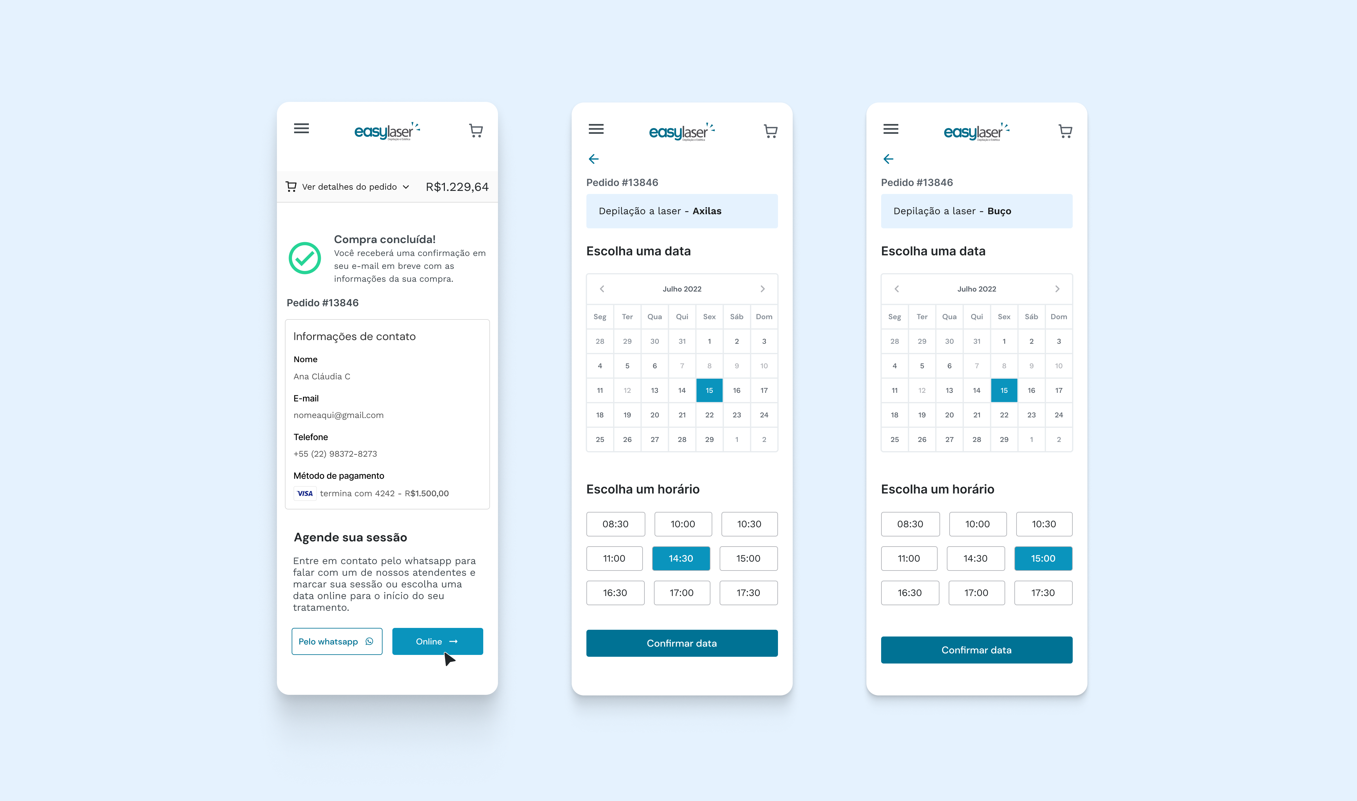
The mobile experience was critical as our average user used their cell phone a lot to be informed and purchase laser treatments. For that reason I started doing some sketches for mobile screens, and then I built medium fidelity wireframes based on the insights from the previous steps.
UI Design
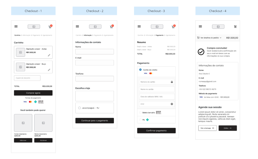
Based on feedback from the project's main stakeholder, some changes were made, mainly in relation to the layout of UX elements and processes at checkout.
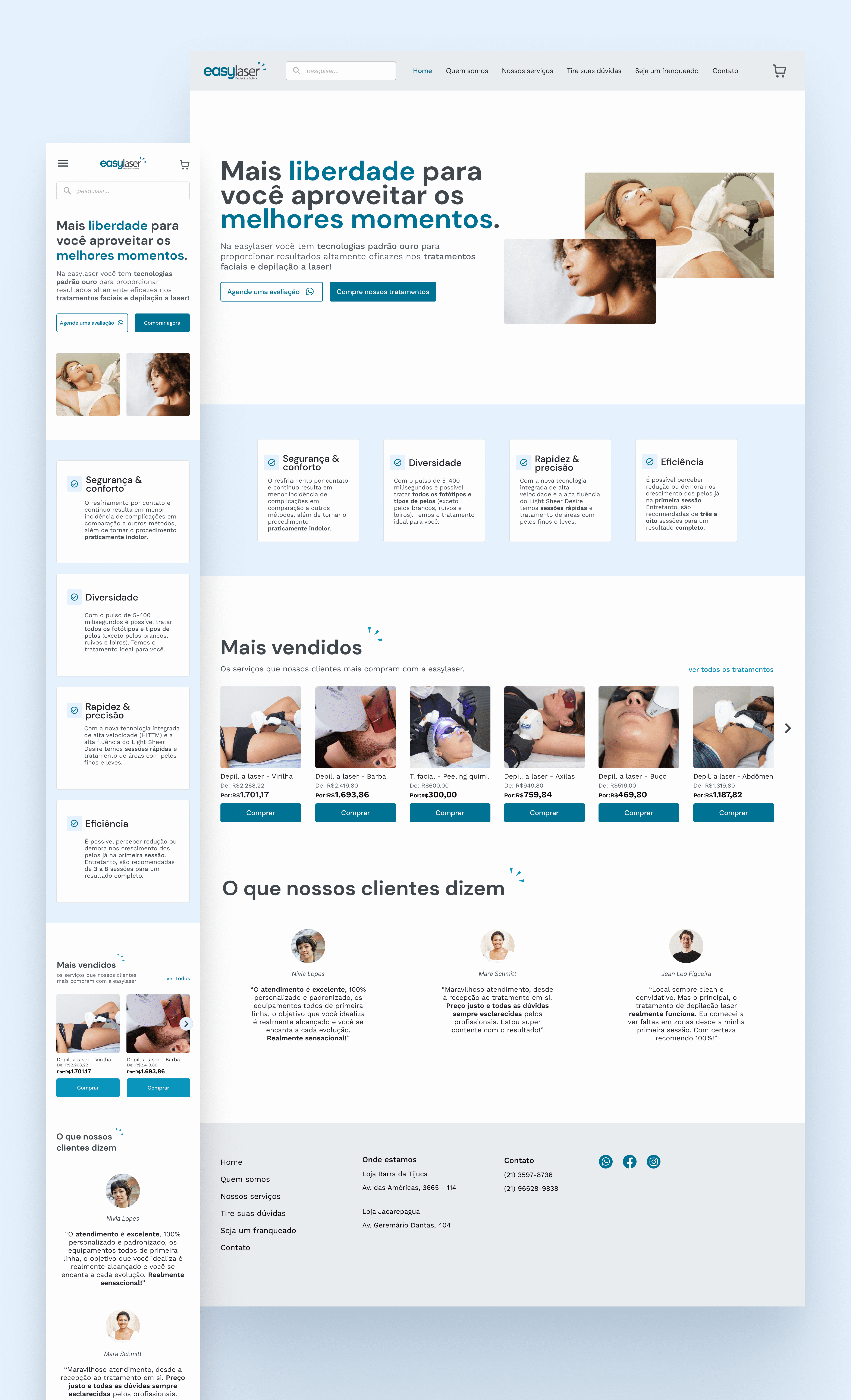
The high fidelity screens were later used to carry out a usability test with some users.
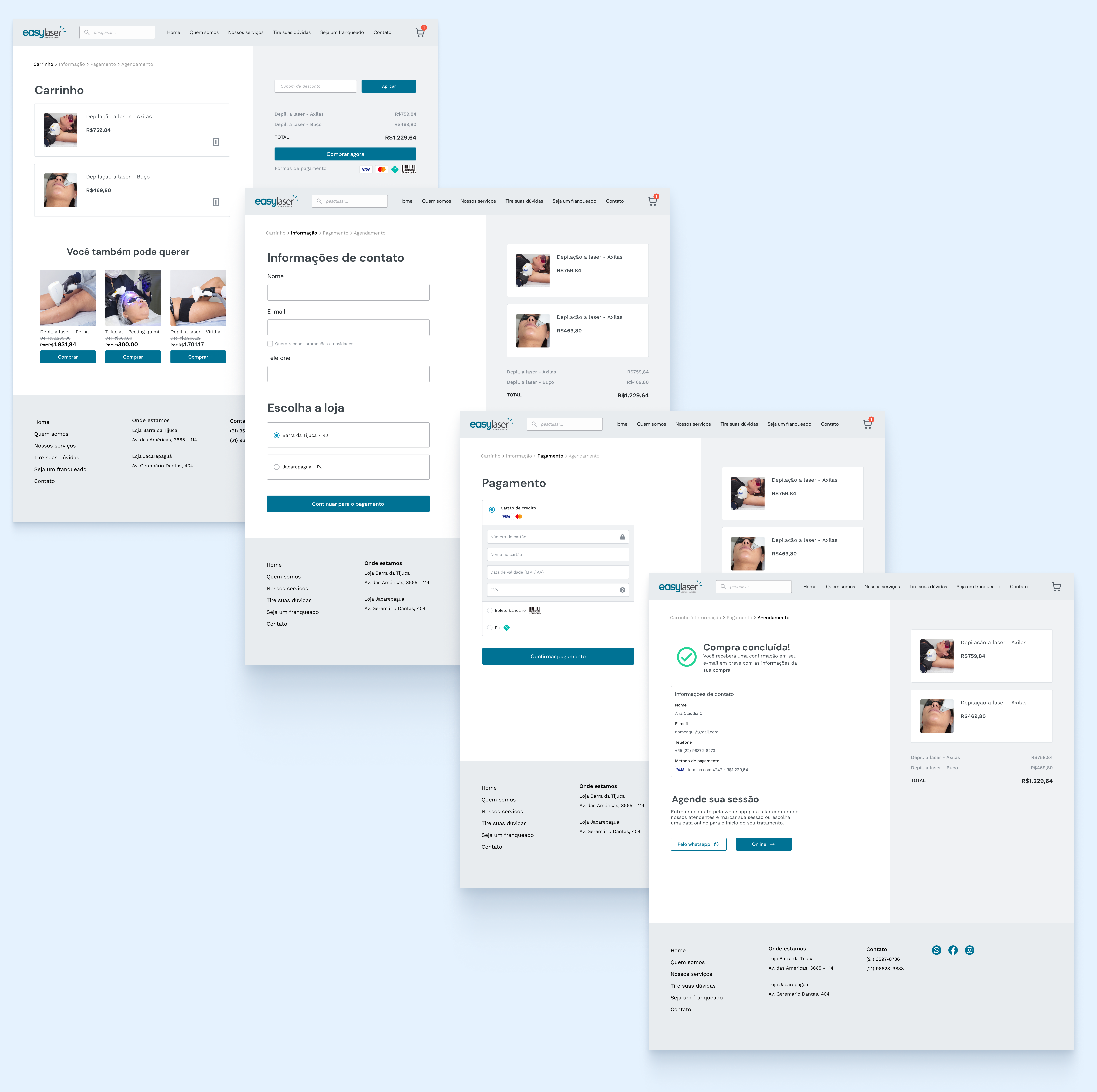
I brought standard components to the site, such as the search bar and cart icon to represent the checkout flow.
I concentrated the main treatment information in a detail page, with a clear purchase CTA. This addition enabled the user to have have suggestions for other recommended treatments and purchase more than one treatment at a time and on the same page.
I kept targeting WhatsApp, since through research I identified that it was a common and more comfortable means of communication for users, but I made the result of this action clearer.

Usability testing
To test whether the website is really easy to use and works for sales of laser procedures, as well as to identify opportunities for improvement, I conducted a usability test with 5 people. Through 3 scenarios, I focused on answering the following questions:
1. How would the user find the information they want
2. What would they do to resolve the doubts they have about the procedures.
3. How would they buy a procedure that they are interested in.
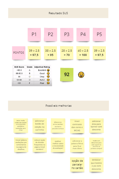
In general, users found it easy to complete tasks. We reached 92 points on the SUS scale, and I wrote down some possible improvements to be included in the backlog.
Learnings
During the project I was able to improve several design techniques to better understand interface components. In addition, I consider as main learnings:
- Confirm problems: always dig deeper and not just accept something as a problem. The client may say that the biggest difficulty is x, when after investigation we discover that the main focus is elsewhere. Only by talking to users and carrying out research can we confirm the real needs of the business and customers.
- Document the entire process: Having all the steps well written and organized helped me to be clear about the next steps and support my choices.
Thanks for reading this far!
For questions or other details send me an email, I'll love to answer!
goncalvesc.anac@hotmail.com