Simci - case study
How to make meal planning easier on a daily basis.
Overview
Project created for personal study, in order to improve my knowledge in the area of UX/UI Design.
Duration
5 weeks (May 2022 - June 2022)
My role
Research, UX and UI Design
Tools
Figma, Notion, Miro, Paper and pen
Context
From observing the eating routine of people close to me and informal complaints I heard, I identified some difficulties in relation to meals. People's hurried routine seemed to make it difficult for them to eat in a balanced way. Our food choices directly impact our health, as the popular saying goes “you are what you eat”. Changing habits, however, is a big challenge.
Thinking about it, I arrived at the hypothesis that the best way to change something and control it is to first know the problem. Thus, writing down what you eat or intend to eat is a way of visualizing habits, identify patterns and pay more attention to make healthier choices. So I decided to embark on this challenge and propose a solution through UX.
Problem
People have difficulty eating properly on a daily basis. (it started as a hypothesis, and then the problem was confirmed through research).
Goal
Create an MVP to optimize time and improve the experience of those who need to prepare their meals on a daily basis.
Research
Insights and main pain points of target audience
Before going on to do some official research, I raised some questions through more informal conversation with potential users in the target audience. I could then identify some pains of the target audience:
- would like to eat better but does not have time to cook
- always end up eating the same things
- find it tiring to have to invent something to eat every day
I turned these assumptions into questions in the form of a online survey consisting of 10 questions that had the general goal of collecting what people's experiences with meal planning are. During the 2 days that the form was available, I got a return of 15 responses.
Some interesting insights that I got from the survey were:
- 66.7% of people plan what they are going to eat in advance, with considerable frequency, but none of them use any organization application.
- Most people choose one day to plan their meals for the week.
- Planning seems to occur according to the items purchased at the market at the beginning of the month.
- The biggest obstacles are being able to eat healthily even with little time available for food preparation.
- Time, expenses and revenue difficulty appear as major frustrations.
From there, I wrote down some possible ideas/opportunities:
- people should be able to view a weekly menu in the app
- suggestion of healthy recipes based on time and available ingredients, that could be like “playlists”, with “quick recipes”, “meatless recipes”, etc.
- planning seems to start at the shopping market of the month, then let users make shopping lists of necessary ingredients would be interesting.
User journey
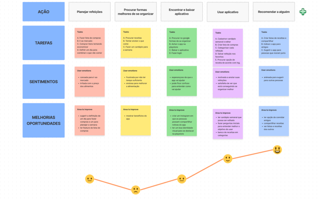
The research showed me the need to map the user's steps in the context of the application and how it would help them achieve their goals, in addition to better consolidating the story I wanted to tell. Thinking about how to improve these steps helped me generate a few more ideas for features the app could have.
Competitor analysis
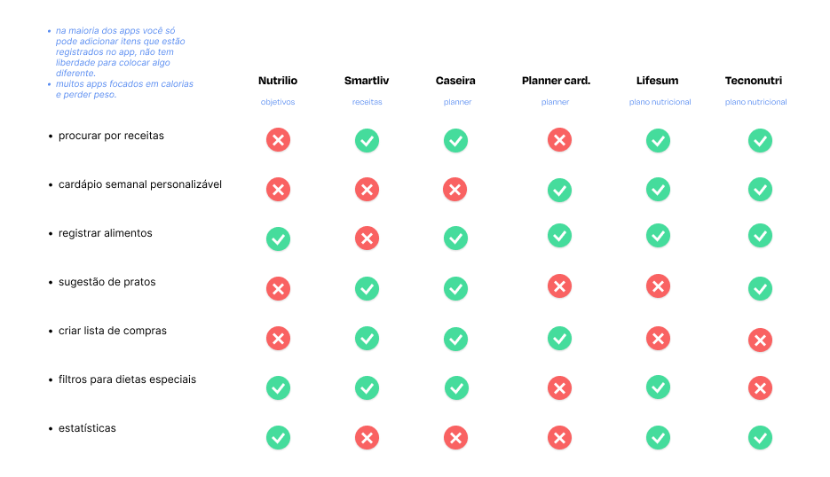
At that point, I thought that exploring other similar products would give me a better sense of the market to understand basic functions, what works and what doesn't work in these apps and have some insights of what I could apply. I picked a few apps that seemed most relevant and selected the main features.
Affinity map and prioritization
At the same time, I wrote down some user ratings left in the reviews of these apps on post-its. I grouped these post-its into an affinity map to help me identify recurring themes and issues.
Afterwards, I evaluated which features would generate a greater impact and less effort in building the app. So I decided to focus on the three main tasks that the user wants to perform in the application (according to the interview responses and competitors' reviews):
- create weekly menu
- search for recipes
- make shopping lists
Paper first
Crazy 8s and Sketches
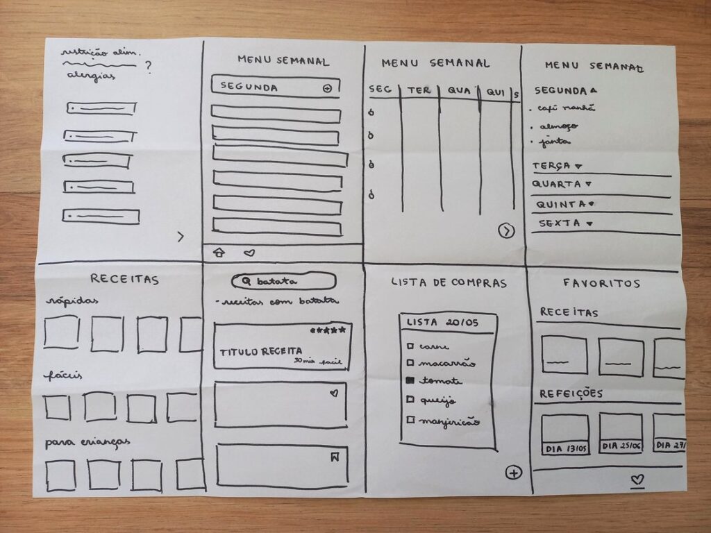
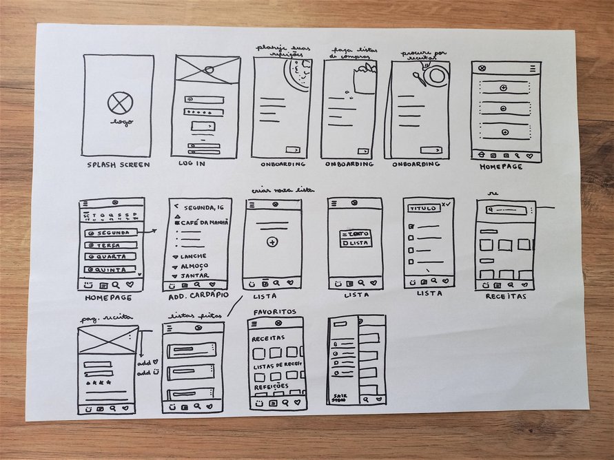
Using the Crazy 8s technique, I put the first visual ideas for the app on paper. The sketches helped me quickly test layouts and options and then choose the best ones to move to Figma.
Wireframes
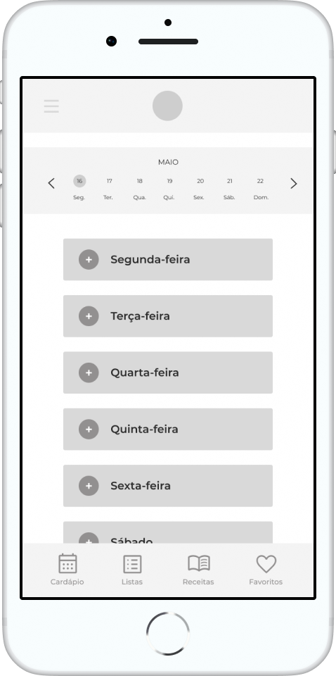
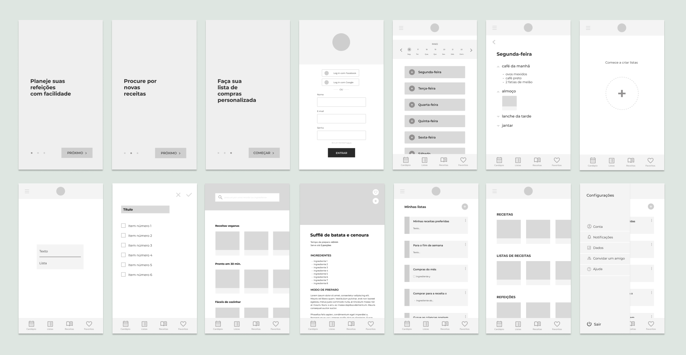
Moving on to digital, I started testing some screen options on Figma. I made medium fidelity wireframes of the main screens that the application should contain.
Usability testing
To validate my prototype solution and identify improvements, I conducted a moderate usability test, remotely, with three potential users. Users don't always do what they say, so it was important to observe how they interacted with the product.
Users should be able to perform three tasks:
- add breakfast to monday schedule
- create a shopping list
- save a recipe to favorites
Key insights from usability testing:
- users performed the first two tasks without major difficulties
- everyone had trouble completing the third task (saving a recipe to favorites).
- one user indicated that he preferred to have words written over icons, as he wasn't sure what would happen when he clicked.
- one user said it was hard to see the days on the calendar and the menu underneath.
- two users indicated that they would like to have access to some kind of “statistics”. One of them asked if he could review the menus he created in the previous week, and another said he would like the app to let him know if he is eating too much fried food or having little variety in what he eats.
Iterating
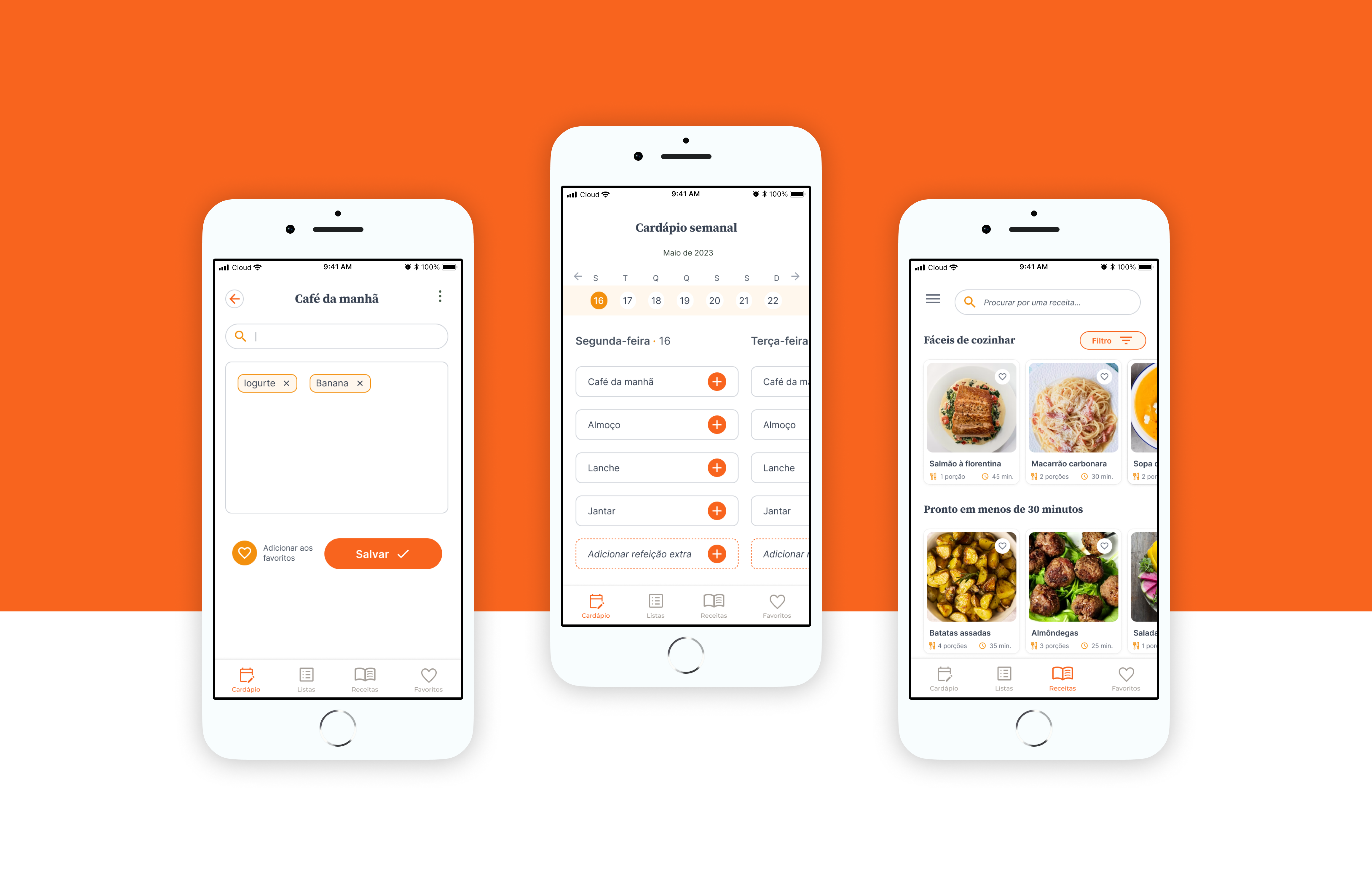
Based on the findings of the usability test, I tested the layout of the screens to solve the problems found. Major changes:
- I added a different color to the menu icons so people know which screen they are on, and changed the icons for more direct instructions on how to save.
- I changed the menu text input to tags so that it would be easier to categorize in future statistics.
- I left the calendar at the top of the larger menu and changed the menu screen to show the entire week, not just one day of the week at a time (as per the survey questionnaire's insight that people tend to plan the entire week at once).
- I made the favorite recipes button more visible, adding a clear reminder of what to do.
Final screens
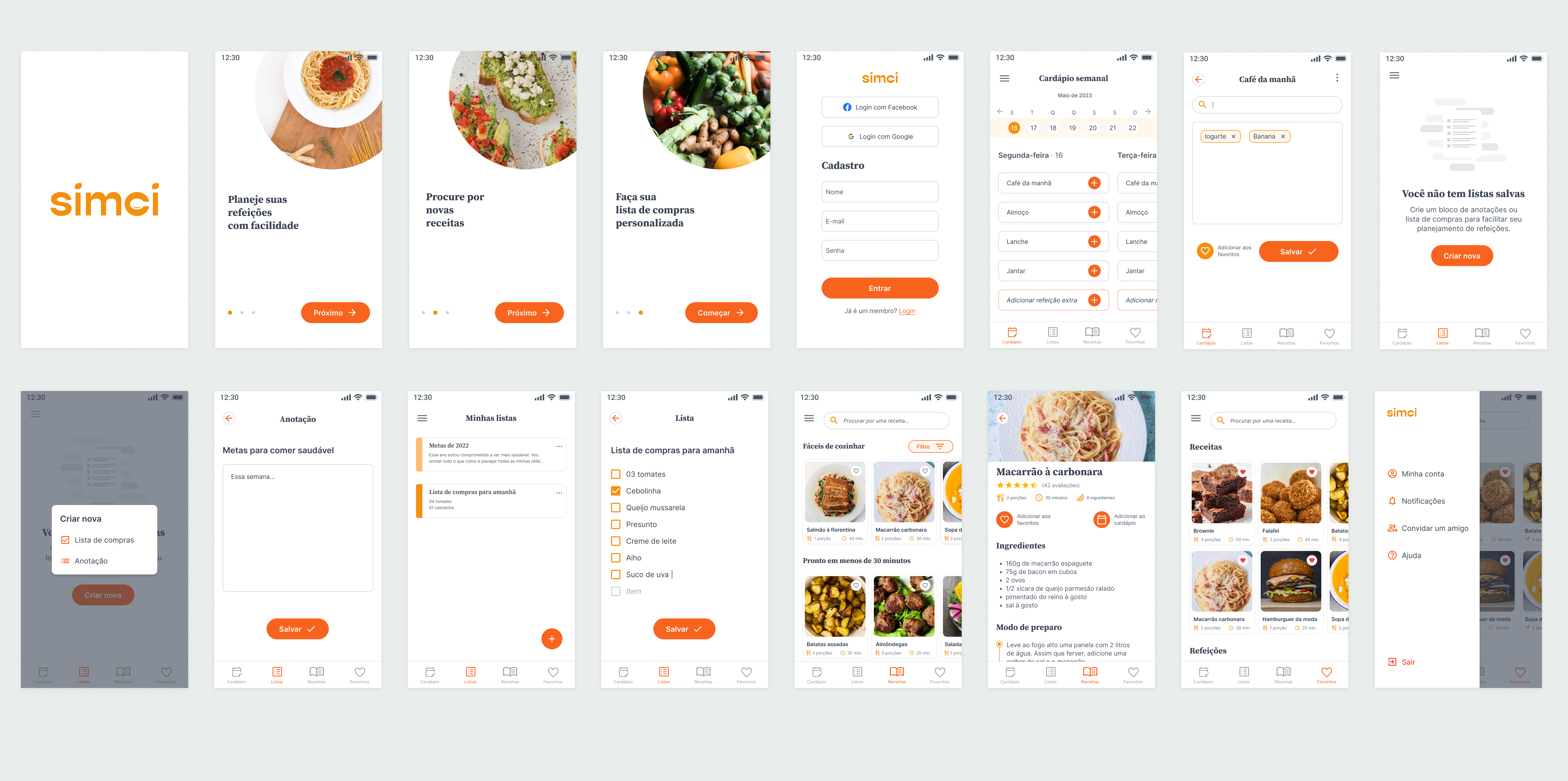
After the final iterations, I wanted to give it a cleaner look, without too many distractions and that would be easy to use even for someone not so tech savvy (like one of the personas). I tried to make the stronger orange for buttons and main actions.
As the prototype is supposed to be an MVP, I removed the statistics functionality, as I would have to research more to understand how to deliver this and the deadline I had set to finish was ending. I decided to focus on the main tasks.
Next steps
- test the final prototype for further iterations.
- studying the implementation of new functionalities, such as the statistics menu that some users indicated the need for.
- ensure WCAG accessibility standards are being followed.
- see about the feasibility of launching the MVP and define success metrics such as retention rate and active users.
What I've learned
Being the first UX project I did, it was very challenging to develop a project by myself from end to end, but it was very enriching to put into practice the tools and techniques that I have been studying. I came to some conclusions:
- Constant feedback: As much as you think you've arrived at a good solution, always validate with users. Something that seems obvious may not be that simple.
- Prioritization: it is not possible to build everything we want. I wanted the project to come out perfect, complete, and that sometimes blocked me from continuing to do it. Doing the best we can with the time we have, without the idea of perfection that we envision, is the best way to keep moving forward.
With the successes and failures of this project, I'm sure I'll take what I've learned to my next professional challenges.
Thanks for reading this far!
For questions or other details send me an email, I'll love to answer!
goncalvesc.anac@hotmail.com