Trinks – Interface Design case study
How to respond to users' pain points and needs when purchasing from a beverage app.
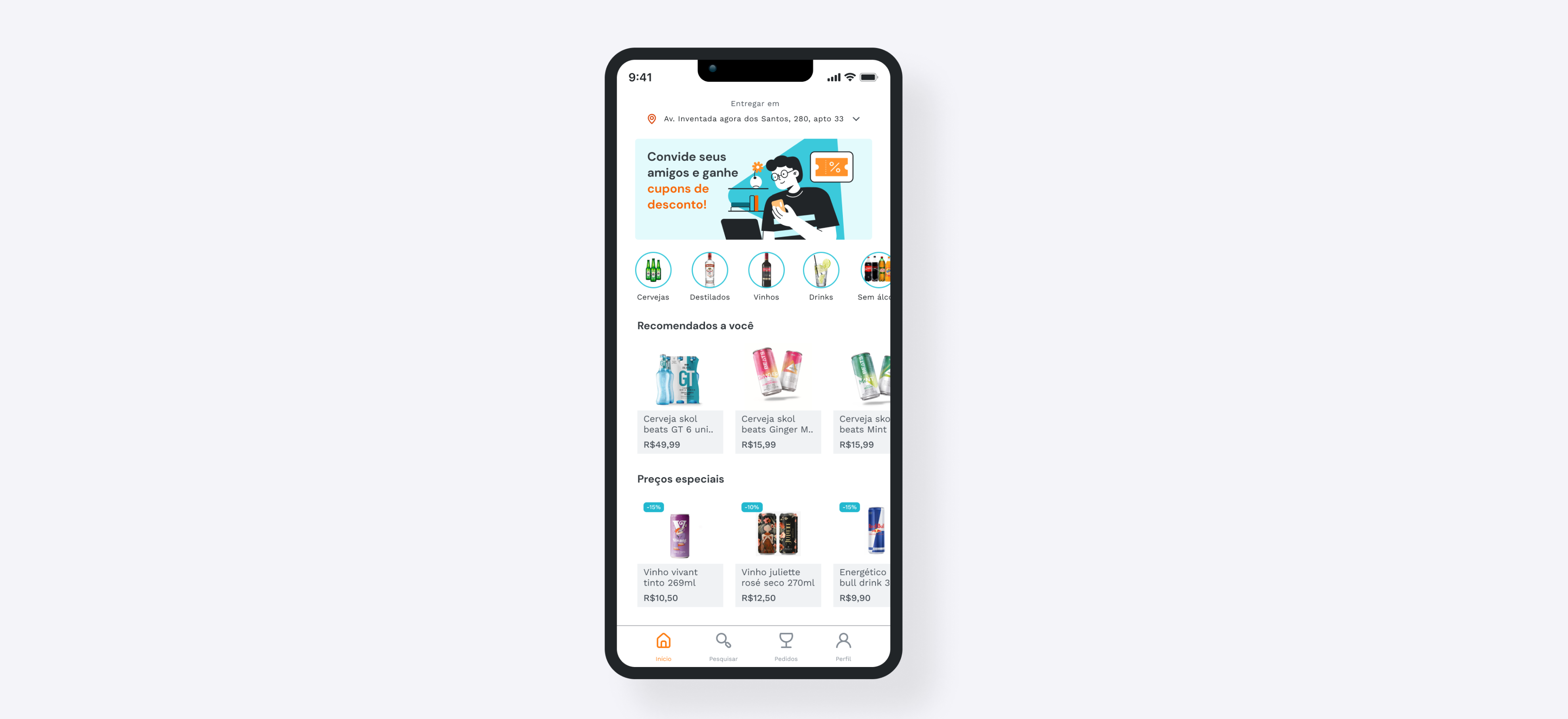
Overview
Project executed during the How education bootcamp “UI Design with Figma.” The goal was to study the best techniques and methods for building interfaces for digital products, in addition to optimizing processes through different Figma functionalities.
Duration
6 weeks (August 2022 – September 2022)
My role
UI Design
Tools
Figma, Notion, Paper and pen
Context
For the bootcamp activities, we started from some pre-defined journeys. The challenge was to create a drink delivery app that intends to revolutionize the small delivery market.
It is a delivery app, which, through pricing and logistics intelligence, allows anyone to receive an order in less than 30 minutes.
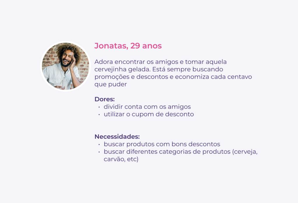
To develop the project, I focused on solving the problems of the target group represented by Jonatas' persona.
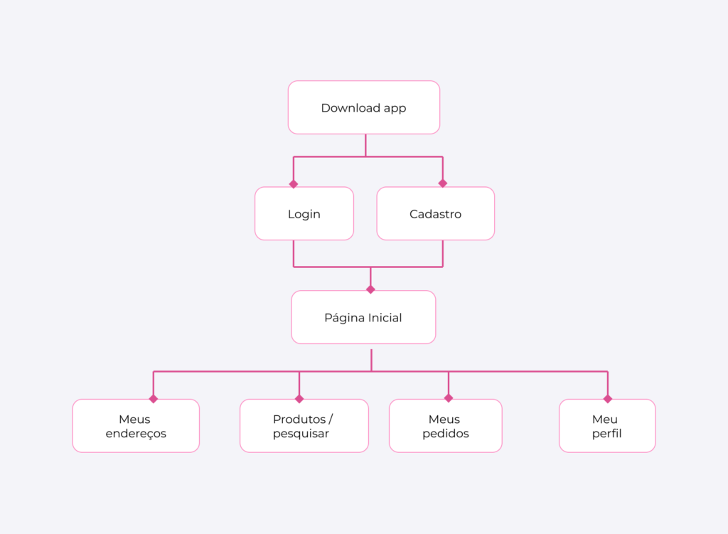
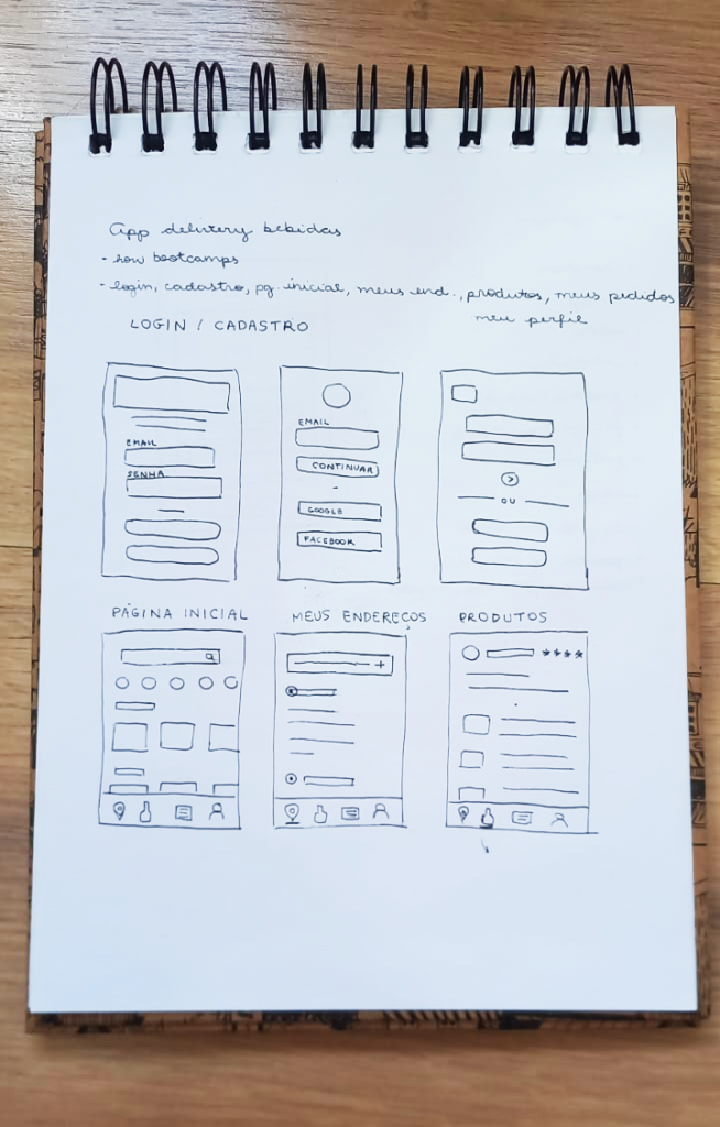
Wireframes
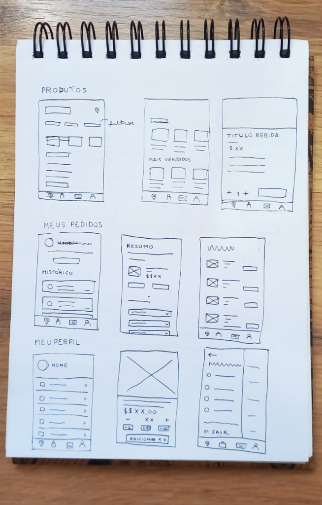
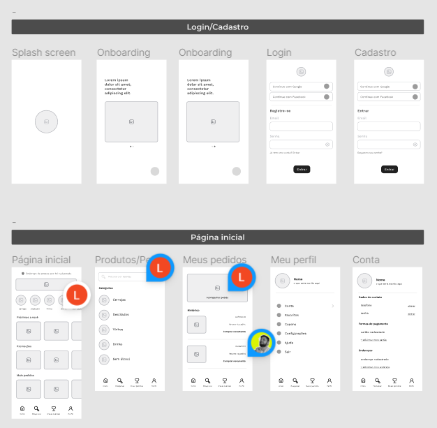
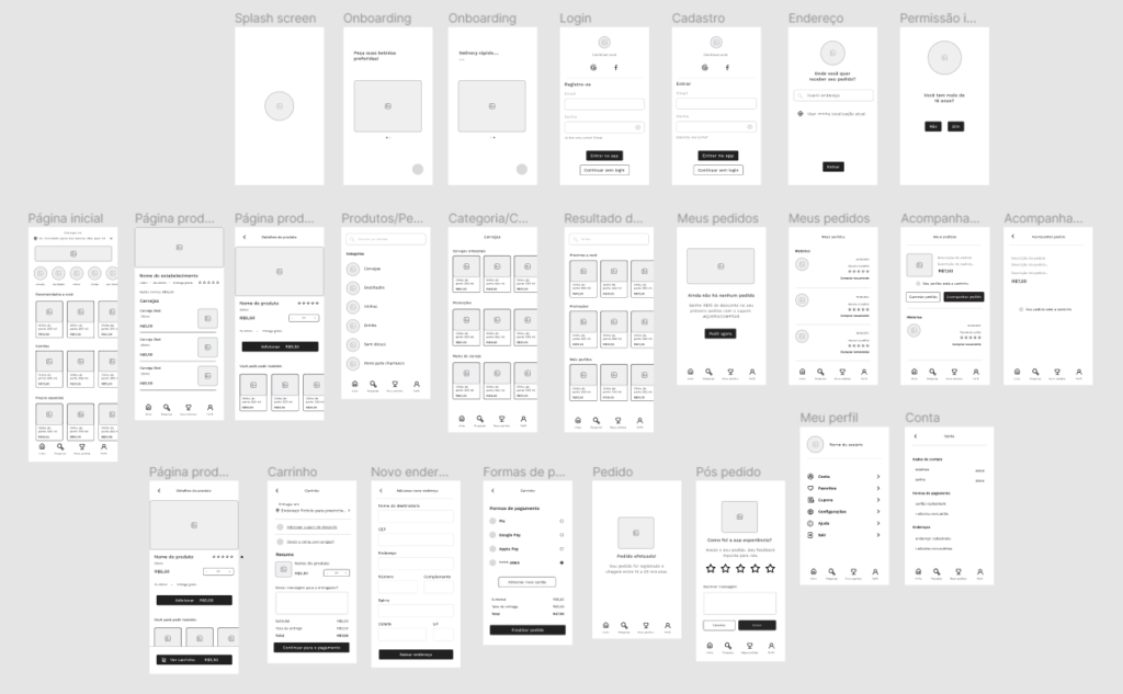
I put the first ideas on paper and refined them based on feedback from the instructors.
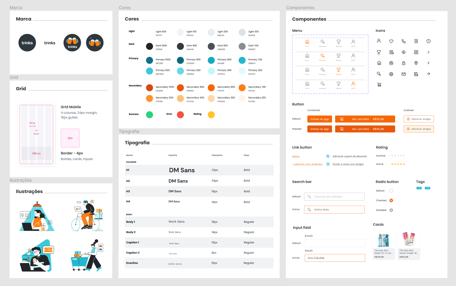
Moodboard and Style Guide
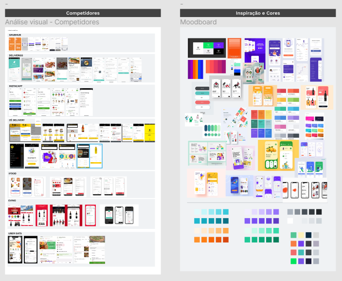
Creating a moodboard with the main references helped me to better define the style I would follow. I did a visual analysis of the main competitors in order to identify basic functionalities that I needed to have and in which points I could improve and stand out.
For this app, I chose a cleaner and more modern look, with a youthful appeal in the illustrations and complementary colors. I knew it couldn't be yellow (colors of our competitor Zé Delivery) and I chose orange for the highlight color (in CTAs and important actions) and the rest to compose the other interactions.
Problems solution
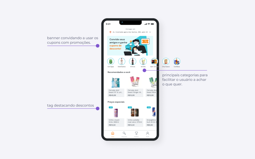
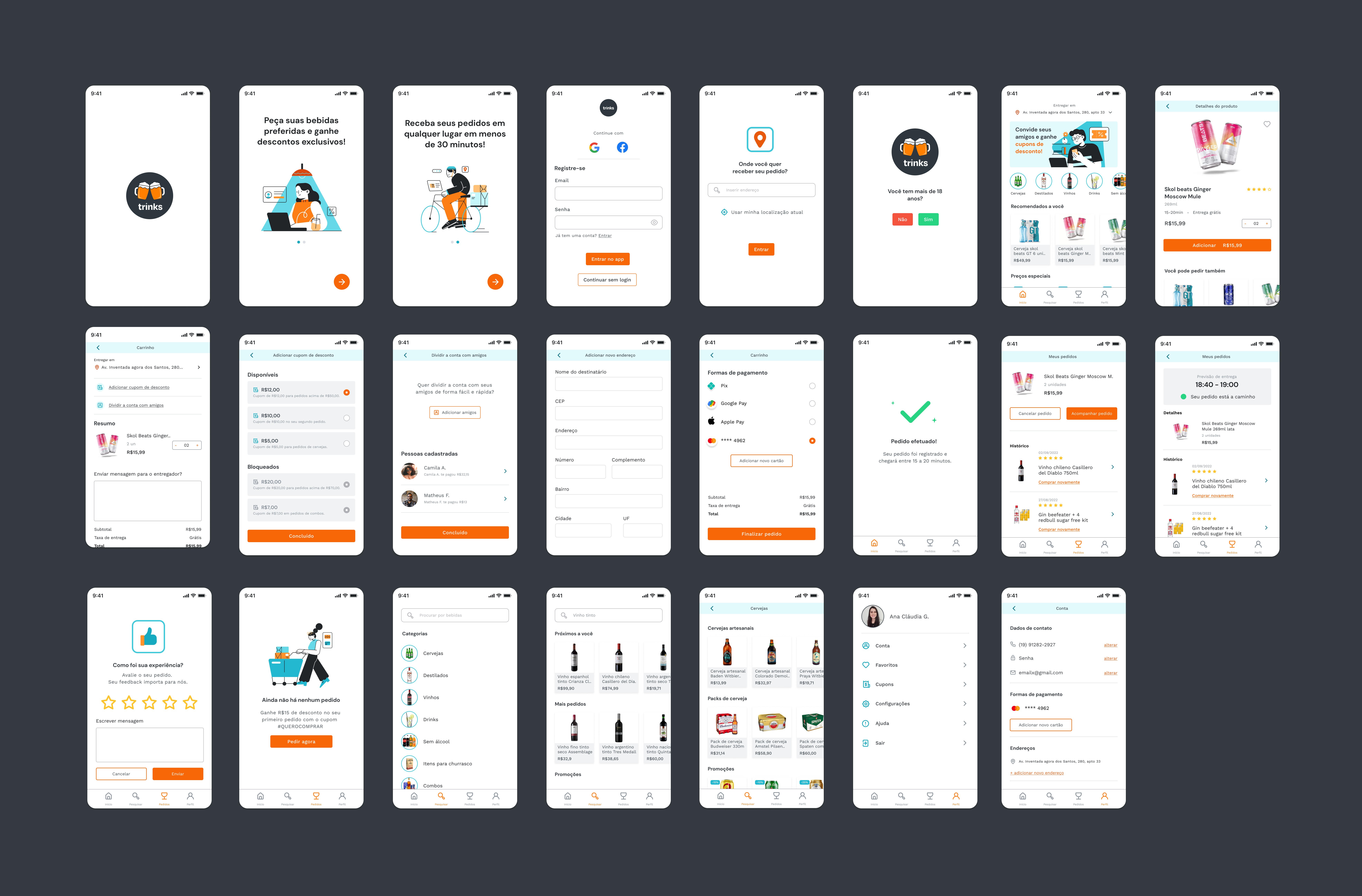
01 - Home/Initial Page
- I thought that the initial screen already contained solutions for the main needs of our persona, which were “search for products with good discounts” and “search for different product categories”.
- In addition, the cards in the “Recommended for you” category will be customized according to user purchases and interactions in the app so that each purchase is easier and more intuitive.
This is the best solution because…
- Having the categories right away on the first screen allows the user to filter and go straight to the product page he wants.
- Sections with products that are on sale meet the user's need to save money.
02 – Add discount coupon
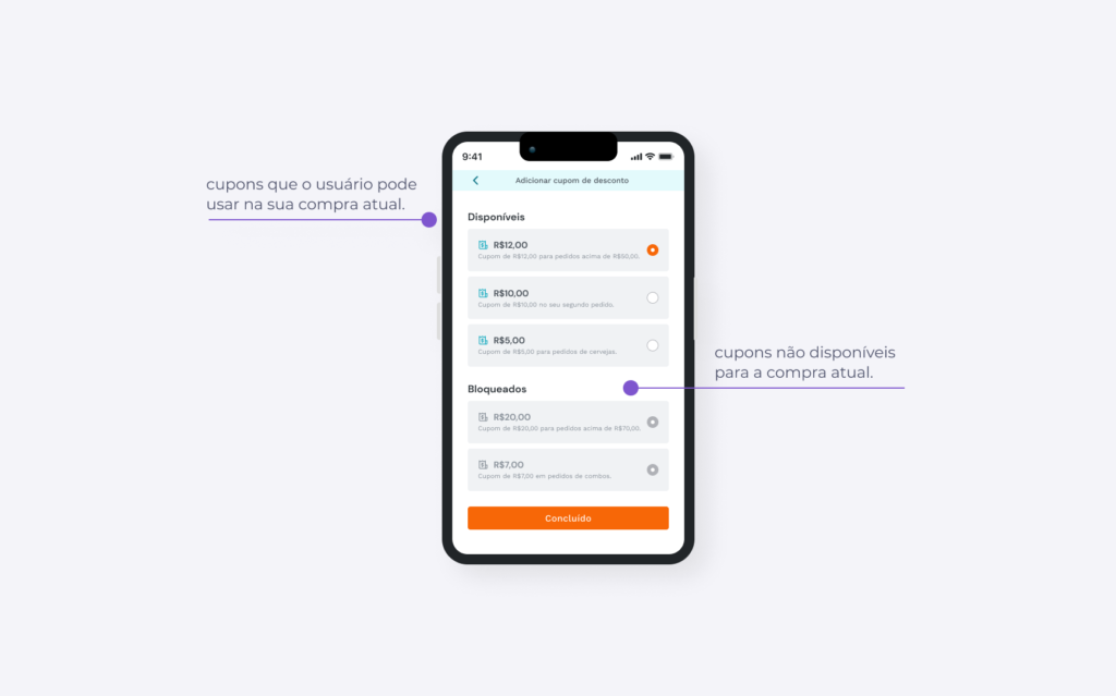
- Our persona is always looking for discounts and saves every penny. Their main pain is using discount coupons.
- With that in mind, after adding a product to the cart, I put an area that shows the coupons that they can use for that purchase. The user will be able to view all the options and then select the one he thinks is best. The discount will be applied to the order after the user clicks done.
This is the best solution because…
- Showing only the coupons that are available for that purchase avoids the frustration of seeing a discount deal only to find out later that you can't take advantage of it. When viewing the blocked coupons, the user can also see coupons for other purchase scenarios/options. Coupons are also included in their normal purchase flow.
03 – Share account with friends
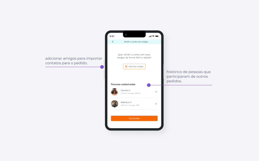
- Our persona, Jonathas, loves to meet his friends and another pain he has is sharing the bill with his friends. It is common for people to drink in social situations, together with other people. When placing large orders, there is a need to divide this amount.
- To understand how to solve this within an app, I looked for references of products that do this, in this case the Splitwise app and the Noh card.
- In the interface, there is a button to add friends and to be able to import contacts from one or more users to split the account. The account can be divided into 2, 3, or even unequal amounts. There is also a history of contacts who have already participated in other requests to facilitate access.
This is the best solution because…
- It splits the “split the account with friends” screen into two main flows: adding a new contact or using a contact that has already participated in other requests.
Final screens
Next steps
- Improve auto-layout in some screens.
- Carry out a usability test to identify possible difficulties and areas for improvement. One of the points I want to test is whether it would make sense to reduce friction by asking for an address and login later in the journey, when the user is actually going to make a purchase.
- Document better for the handoff.
- Define success metrics.
Thanks for reading this far!
For questions or other details send me an email, I'll love to answer!
goncalvesc.anac@hotmail.com